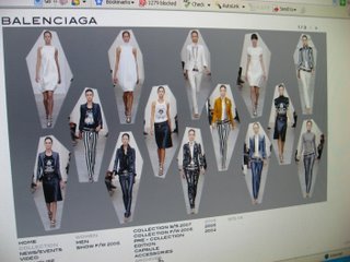
surprise! a fashion house website i actually like...
Websites of luxury fashion houses are often confusing, slow to upload, low on information, full of overblown flash animation, or just a pathetic spread of their's latest ad campaign (like I can't see it already in a magazine), but a happy exception is the Balenciaga website, at http://balenciaga.com -
An earlier chapter is a clip of the Balenciaga spring/summer show in 1960, which offers a glimpse of the much revered Balenciaga designs in motion - instead of it being displayed on some mannequin behind a glass pane.

There's also a cute video devoted to the Classic bag, featuring the bag itself being swung around jauntily as a woman totes it all over town. There's not much meaning to it, but it's just amusing to watch, and again, it's nice to see fashion in motion and being worn rather than simply stiffly photographed and displayed -

The best thing about the site is the language - it is clear, concise and completely devoid of the flowery and esoteric expressions other fashion labels tend to have. For example, the description of the Balenciaga.Edition collection reads as such -
"The “Balenciaga.Edition” series is part of the women’s ready-to-wear collection, and presents designs following closely the original Haute Couture pieces from Cristobal Balenciaga’s collections, carefully curated from the House of Balenciaga's priceless archives.
To identify this series, each piece will carry a special label and tag stating the original date of design."

It's really a user-friendly site.

The website is well-organised and a wealth of interesting information, from the history of the house to the modern inspiration and muses of Nicolas Ghesquiere, and it also has a complete archive of all the looks from the runway shows.
It's a great introduction to the heritage of Balenciaga, without being all long-winded and over-exaggerated in the way homages to the label tend to be these days.
I like the Balenciaga online book feature, which I think is a new feature, I haven't noticed it before. It can be found under the heading "The House". The latest chapter is Balenciaga muse Charlotte Gainsbourg's music video for her song "The songs that we sing", which is surprisingly catchy - it stays with you.
An earlier chapter is a clip of the Balenciaga spring/summer show in 1960, which offers a glimpse of the much revered Balenciaga designs in motion - instead of it being displayed on some mannequin behind a glass pane.

There's also a cute video devoted to the Classic bag, featuring the bag itself being swung around jauntily as a woman totes it all over town. There's not much meaning to it, but it's just amusing to watch, and again, it's nice to see fashion in motion and being worn rather than simply stiffly photographed and displayed -

The best thing about the site is the language - it is clear, concise and completely devoid of the flowery and esoteric expressions other fashion labels tend to have. For example, the description of the Balenciaga.Edition collection reads as such -
"The “Balenciaga.Edition” series is part of the women’s ready-to-wear collection, and presents designs following closely the original Haute Couture pieces from Cristobal Balenciaga’s collections, carefully curated from the House of Balenciaga's priceless archives.
For the Fall/Winter 2006/07 season, the series comprises twenty ready-to-wear designs and thirteen jewelry pieces, each one based closely on an original Haute Couture piece from Cristobal Balenciaga's collections dating from 1954 to 1968.
To identify this series, each piece will carry a special label and tag stating the original date of design."
And then the page itself features a nice parallel between the old and new designs, spread out clearly and simply.

It's really a user-friendly site.
I also like the effort put in overall layout. For instance, the collections aren't simply pop-up slideshows -

The spread lets you see eveything and gives you a good sense of the overall feel for the collection.
So go check out the site that could inspire all of us to make more effort in online presentation.
Pictures of Balenciaga website shot with own camera


Comments