white out
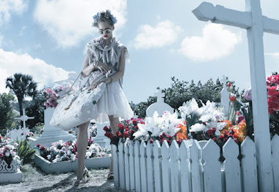
I didn't get around to posting about the gorgeous spread in the March issue of W, featuring Sasha Pivovarova, and it is very unforgivable of me, because it is simply stunning -


Shot by Michael Thompson, it's the kind of editorial that aims to photograph the oft-seen (the usual line-up of spring fashions we've all seen to death by now) differently.
And it works. I love the icy colours, and how it's set in a beach, like you would expect spring/summer fashions to be, but everything is pale instead of lush like your usual "50 best swimsuits" spread, but it doesn't look washed out.
There's something vaguely retro about some of the shots, like this one on the right -

It reminds me of a Hitchcock heroine.
All in all, it's the best beach spread I've ever seen.
Pictures taken from http://community.livejournal.com/foto_decadent/1488783.html#cutid1


Shot by Michael Thompson, it's the kind of editorial that aims to photograph the oft-seen (the usual line-up of spring fashions we've all seen to death by now) differently.
And it works. I love the icy colours, and how it's set in a beach, like you would expect spring/summer fashions to be, but everything is pale instead of lush like your usual "50 best swimsuits" spread, but it doesn't look washed out.
There's something vaguely retro about some of the shots, like this one on the right -

It reminds me of a Hitchcock heroine.
All in all, it's the best beach spread I've ever seen.
Pictures taken from http://community.livejournal.com/foto_decadent/1488783.html#cutid1

Comments