colour bar
My eye, in a an aberration from my usual tendency towards muted non-colours, has been drawn to bright, saturated hues.
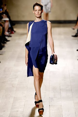
Blue is a safe zone to venture into for a start -

Yellow is suddenly also all promise, in mustard and marigolds - 


Blue is a safe zone to venture into for a start -


(Celine spring '10; Oscar de la Renta spring '10)
Yellow is suddenly also all promise, in mustard and marigolds -


(Haider Ackermann spring '10; Dries Van Noten spring '10, Dries Van Noten spring '09)
Red would be my pick if I were daring, and if it flattered my skin tone (it doesn't) -


(Chloe cruise '10; Celine pre-fall '10; Marni fall '10; Bottega Veneta fall '10)
It may not be how I personally want to dress, but it's so refreshing just to look compared to the safe and tasteful blacks and now beiges. One isn't better than the other; it's just variety in ideas I enjoy.
Anyway, all these colourful thoughts bring to mind a lovely Vogue Paris editorial from 1997, featuring the fantastic Alex Wek, who wears clothes so well -


Comments