the weird and wonderful of louis vuitton
Do I care for Louis Vuitton? Erm, no. The classic monogrammed and damier check and epi leather styles never appealed to me - why would I care for a bag that's simply been slathered with logos and looks stiff as cardboard? I understand the way it conveys instant luxe (even though the rampant piracy has kind of tainted that) and the appeal it has to traditional types, but for me, it's taken on a tired feel - just not my thing.
That is, until the label started coming up with all these fabulous and inventive ways of redoing at the classic logos and styles. It started with the collaborations with Stephen Sprouse and Takashi Murakami, which I didn't like much, but I appreciated the way Louis Vuitton was messing around with their traditional look, at least they were trying to be creative. All Prada and Gucci could do was blow their logos up.
And then in spring 2004, Louis Vuitton suddenly started whispering to me. For one thing, I liked the ready-to-wear collection, with the gold detailing and subtle Hollywood/Nile goddess influences. And the bags started appearing with more interesting textures and heavier hardware I like on my bags.
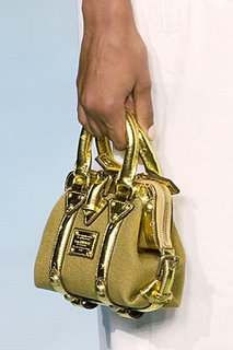
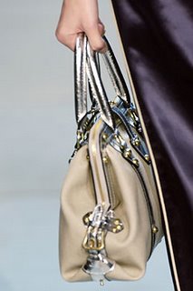
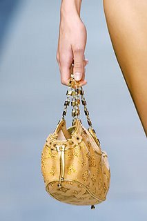
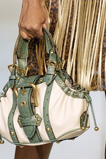
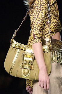
Then came spring 2005, where out of nowhere all these wonderful skins and textures started appearing and mixed in a way that bordered on gaudy but didn't - it was fabulous and exuberant.
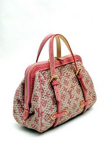
I love the "pile-it-on!" vibe of these purses -
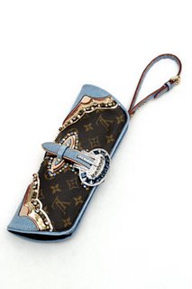
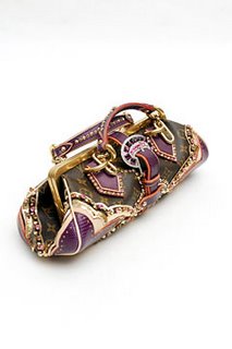
It should be tacky, but it isn't, it's just wonderfully glamorous.
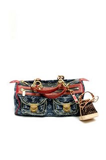
And the denim monogram, however New Rich it seemed, was a fun take on a classic - for the first time, I wanted the monogram.
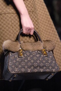
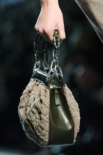
Fall 2005 was lush and quiet but no less opulent.
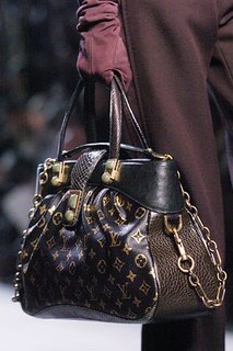
The embossed leather also made for a nice departure from a printed monogram, and the unusual colour choice makes it actually kind of edgy - and since when is Louis Vuitton edgy?
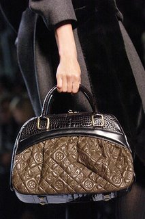
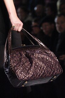
Skipping past the kind-of-tacky spring 2006 collection, fall 2006 featured a nice line-up that rathered recalled features you found in Marc Jacobs bags - softer shapes, heavier hardware, and those chain-link straps in tortoiseshell - elements of a personal stamp perhaps? It definitely appealed to existing Marc Jacobs fans like me.
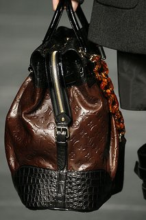
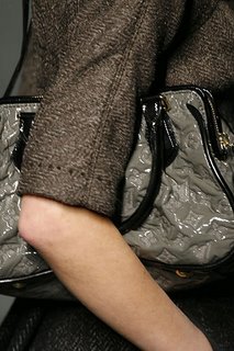
The bags also came in a shiny embossed material, which is feels unexpected because luxury bags don't usually get this kind of finish - I supposed it doesn't look rich enough, but then with Louis Vuitton they should play with the look because they're already so iconic - it's less boring. And this wasn't the annoying high-gloss look of the Monogram Vernis collection - this is much less Barbie.
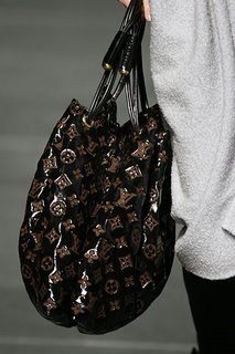
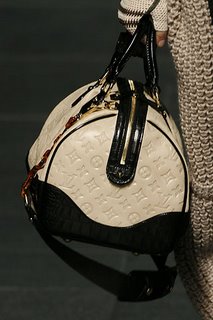
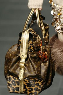
This mix of leopard, gold snakeskin, tortoiseshell AND monogramming should border on being supremely ugly but it didn't - it works and I guess the rich, sombre hues have something to do with that.
And I also liked the elaborate new ways they found for applying the LV logos -
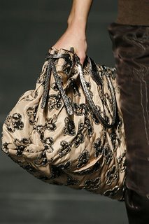
What was good about the bags was that even though they featured the heavy detailing that separated them from the usual styles that renders a bag classic, I felt they had a sense of timelessness - you weren't necessarily going to tire of them the way you got tired of the Sprouse graffiti-ed ones.
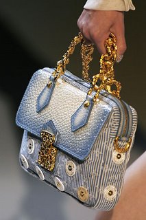
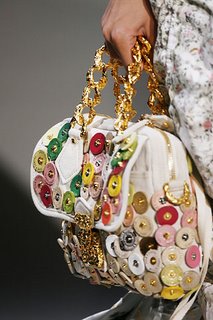
Spring 2007, however, was kind of hideous, but maybe because I usually prefer fall accessories - the colours are richer and the textures more interesting. Besides, while the previous bags bordered on overdone, most of these seem overdone.
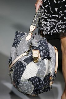
And this one really looks like a plastic supermarket carrier -
I mean, I love most of what Marc Jacobs does, but he's got to be kidding with those bags right. There's quirky, and then there's ugly.
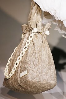
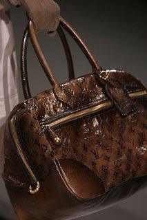
I do make an exception for this lovely chocolate brown number - it's yummy in the way a big shiny Mars bar with golden caramel on the inside is yummy.
The bags are pricey, and I know for the same amount of money I ought to buy myself a Hermes Birkin or Kelly (which are no doubt of better quality), but there's something irresistable about these weirdly wonderful Vuittons. I hope some fall 2007 the lapse in good taste would have vanished - it'd be such a disappointment in what was otherwise a fascinating rebirth of an iconic brand.
All pictures from Style.com
That is, until the label started coming up with all these fabulous and inventive ways of redoing at the classic logos and styles. It started with the collaborations with Stephen Sprouse and Takashi Murakami, which I didn't like much, but I appreciated the way Louis Vuitton was messing around with their traditional look, at least they were trying to be creative. All Prada and Gucci could do was blow their logos up.
And then in spring 2004, Louis Vuitton suddenly started whispering to me. For one thing, I liked the ready-to-wear collection, with the gold detailing and subtle Hollywood/Nile goddess influences. And the bags started appearing with more interesting textures and heavier hardware I like on my bags.


Then came spring 2005, where out of nowhere all these wonderful skins and textures started appearing and mixed in a way that bordered on gaudy but didn't - it was fabulous and exuberant.

I love the "pile-it-on!" vibe of these purses -


It should be tacky, but it isn't, it's just wonderfully glamorous.
And the denim monogram, however New Rich it seemed, was a fun take on a classic - for the first time, I wanted the monogram.

Fall 2005 was lush and quiet but no less opulent.


The embossed leather also made for a nice departure from a printed monogram, and the unusual colour choice makes it actually kind of edgy - and since when is Louis Vuitton edgy?


Skipping past the kind-of-tacky spring 2006 collection, fall 2006 featured a nice line-up that rathered recalled features you found in Marc Jacobs bags - softer shapes, heavier hardware, and those chain-link straps in tortoiseshell - elements of a personal stamp perhaps? It definitely appealed to existing Marc Jacobs fans like me.

The bags also came in a shiny embossed material, which is feels unexpected because luxury bags don't usually get this kind of finish - I supposed it doesn't look rich enough, but then with Louis Vuitton they should play with the look because they're already so iconic - it's less boring. And this wasn't the annoying high-gloss look of the Monogram Vernis collection - this is much less Barbie.


This mix of leopard, gold snakeskin, tortoiseshell AND monogramming should border on being supremely ugly but it didn't - it works and I guess the rich, sombre hues have something to do with that.

And I also liked the elaborate new ways they found for applying the LV logos -

What was good about the bags was that even though they featured the heavy detailing that separated them from the usual styles that renders a bag classic, I felt they had a sense of timelessness - you weren't necessarily going to tire of them the way you got tired of the Sprouse graffiti-ed ones.
Spring 2007, however, was kind of hideous, but maybe because I usually prefer fall accessories - the colours are richer and the textures more interesting. Besides, while the previous bags bordered on overdone, most of these seem overdone.


And this one really looks like a plastic supermarket carrier -

I mean, I love most of what Marc Jacobs does, but he's got to be kidding with those bags right. There's quirky, and then there's ugly.
I do make an exception for this lovely chocolate brown number - it's yummy in the way a big shiny Mars bar with golden caramel on the inside is yummy.

The bags are pricey, and I know for the same amount of money I ought to buy myself a Hermes Birkin or Kelly (which are no doubt of better quality), but there's something irresistable about these weirdly wonderful Vuittons. I hope some fall 2007 the lapse in good taste would have vanished - it'd be such a disappointment in what was otherwise a fascinating rebirth of an iconic brand.
All pictures from Style.com

Comments